The Deal slippage page provides a helpful overview of how the pipeline for the business has changed through time. It allows users to compare the pipeline today to a previous date so they can immediately see what has changed.
How it works
- Chart colours - each colour represents a different type of change to the pipeline.
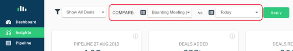
- Dates compared - using the two comparison drop downs at the top of the page, users can select to compare their current pipeline to a previous date (baseline). Baselines are saved automatically every two weeks or users can create baselines on demand from the Pipeline page - find out more.
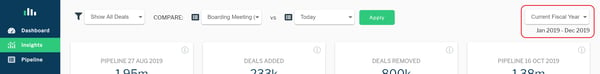
- Filters - by default each chart shows all data for the Current Fiscal Year only, but users can use the filters at the top of the page to view different periods or to drill into particular teams. The filters apply to all charts and widgets on the page.
- Date filter - use the period selector in the top right-hand of the screen to view different periods.
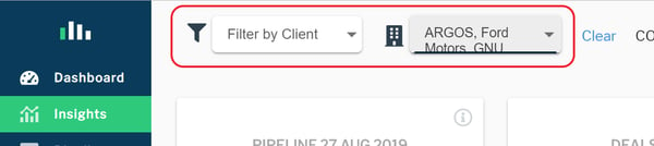
- Client/Owner/Deal filters - use the filters in the top left-hand of the screen to filter the charts to different clients or owners or deals.
- Date filter - use the period selector in the top right-hand of the screen to view different periods.
Chart 1 - Pipeline changes
The first chart shows the overall changes in the pipeline, with the comparative pipeline in grey on the left-hand side of the chart and the latest pipeline also in grey on the right-hand side of the chart. The coloured bars in-between represent different changes in the Pipeline between the two dates.
By default the pipeline includes amounts for the Current Fiscal Year only, but users can toggle to view other periods using the period selector in the top right-hand side of the screen.
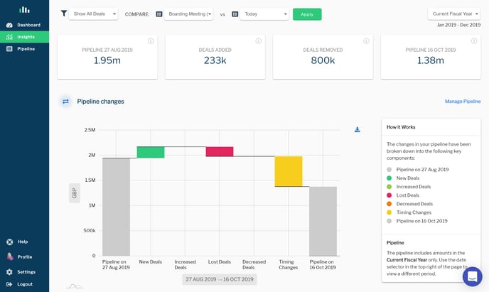
Chart 2 - Pipeline changes by client
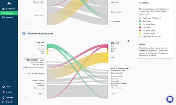
The second chart breaks down the pipeline changes even further, by dividing each change across the top 10 clients. Again, the comparative pipeline is in grey on the left-hand side of the chart and the latest pipeline also in grey on the right-hand side of the chart. The coloured ribbons in-between represent different changes in the Pipeline for each client. Clients outside the top 10 are grouped together at the bottom as <Other>.
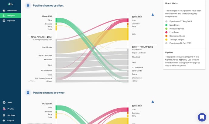
Chart 3 - Pipeline changes by owner
The third chart is the same as Chart 2 above (Pipeline changes by client), but shows the split by the top 10 owners (rather than clients).
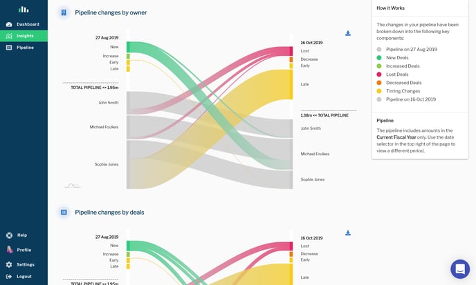
Chart 4 - Pipeline changes by deals
The fourth chart is the same as Charts 2 & 3 above (Pipeline changes by client/owner), but shows the split by the top 10 deals (rather than clients/owners).